The Woes and Wonders of Wayfinding Design
Finding our way around a venue is probably something most of us don’t think so much about. That is, until we get lost and start complaining that the signs are not clear.
And that when we realise the importance of good wayfinding design.
Let Kelley Cheng, creative director of The Press Room, illuminate and illustrate the finer points – and humourous side – being a wayfinding designer in her own words.
1. Some places don’t need wayfinding

Good wayfinding strategies are about having as few signs as possible to lead a person from one point to another. But sometimes clients are so scared of visitors getting lost that that they ask for lots of interim signs. Remember, some places such as museums and theme parks are meant for you to get a little lost and discover surprises. It’s not like hospitals and schools where signs should be at detailed as possible.
2. Not seeing the big picture
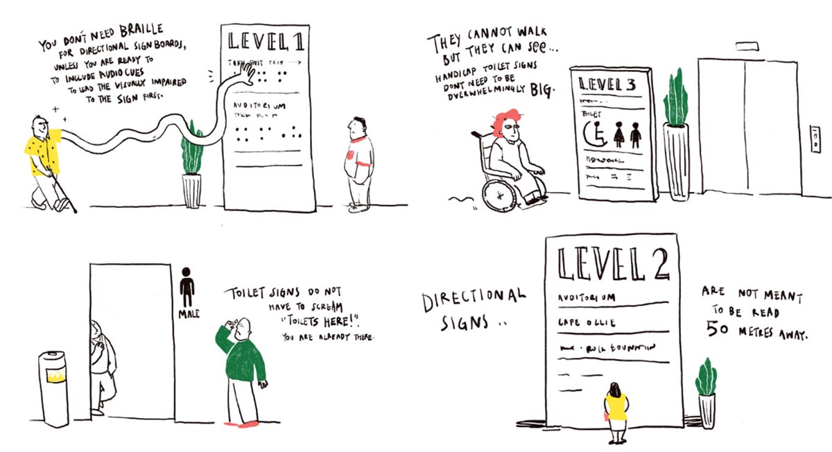
There are minimum size requirements for the use of icons such as the handicap sign. But I’ve encountered clients who are worried these cannot be seen and want these handicap signs to be bigger than needed. We have to remind them that these are users who are physically impaired, and not visually. Another thing I’ve noticed are client requests that don’t doesn’t make sense. Once we were asked to include braille for the blind in a visual art gallery.
Toilet icons are another quirk. Client are often afraid that people cannot see them. But why do they have to be so big? Moreover, seeing them means that you are already there – at the toilet! Related to that, clients are always, always, asking for bigger and bigger font sizes for directional signs. But that affects the proportion of our design and overall typography, given that you can’t increase the size of the signboard. The rule of thumb is that every additional 2.5 metres will call for an average of 2.5 cm increase in font height. There is a limit to how much you can increase!
3. Good architecture helps wayfinding

As a wayfinding designer, we often need to mentally navigate a space to design strategies and plan all the locations of the signboards even before a building is erected. Most times, good wayfinding strategies are only possible if the architectural floorplans and spaces are well thought out. The best wayfinding design is often borne out of a good collaboration between the architect and the wayfinding designer. One such collaboration is marking a destination by creating “landmarks” – putting something with a physical presence like a fountain or a sculpture. This is especially effective for key meeting points. Trust me, you won’t even need a signboard.
4. Carparks can go beyond using colours and animals as markers, you know

Designing car park zones can actually be so much more fun and creative, especially in smaller car parks where you can use creative illustrations to identify the zones. I don’t understand we’re stuck using colours, alphabets, flower and animal icons.
5. Brochures are not scrolls

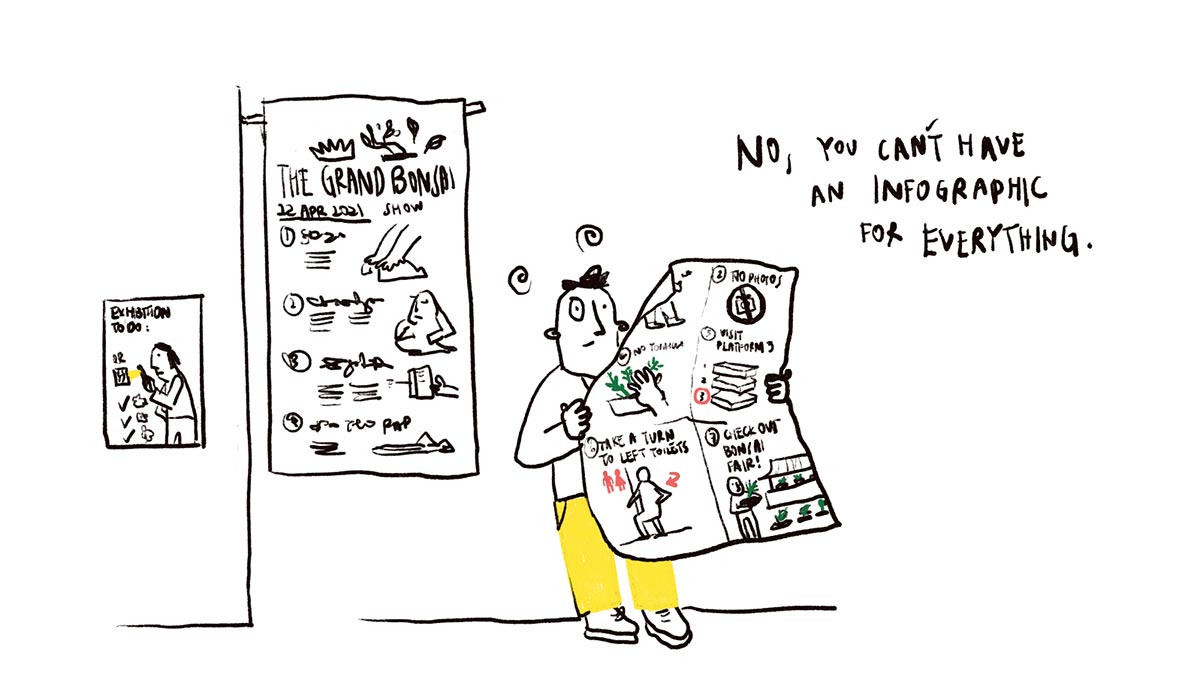
Very often, we get asked to design an accompanying brochure for a venue to feature its floorplans. But clients like to keep adding information, so much so the brochure ends up looking like a scroll. Maps/floorplans are intrinsically a form of infographic and should be self-explanatory. You should not need to explain it with more text and information!
6. Think Hansel and Gretel when it comes to wayfinding
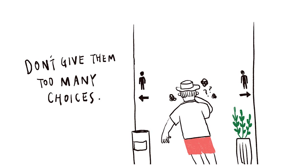
I don’t know if it’s their way of getting their money’s worth but there have been clients who demand for as many signs as possible. This can be counter-productive. When you have too many signs leading to the same destination, giving the user too many choices, it serves to confuse more than guide. Hansel and Greta taught us a story about breadcrumb wayfinding. Very often in wayfinding, the most primitive strategies are best and most intuitive.
Kelley Cheng is the creative director of The Press Room and the illustrations are done by her team member Will Chong. Kelly’s experiences and insights into Wayfinding Design were first shared as part of a webinar, Crafting Experiences: Stories by Experiential Designers from South-East, by SEGD Singapore.


