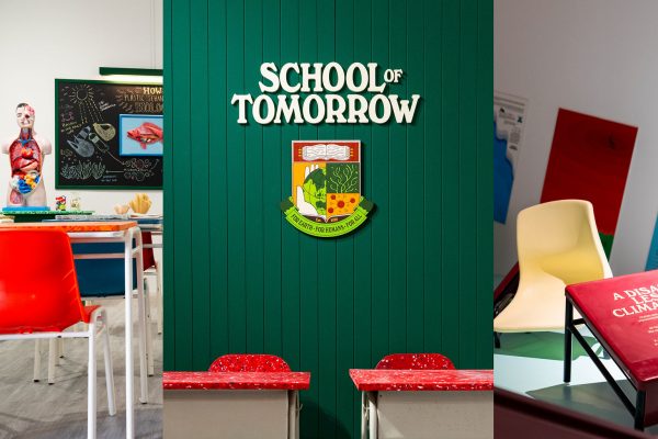
Over the last two decades, Hanson Ho has developed a celebrated body of contemporary and distilled designs that have represented Singapore to the world. The recipe for his creative success? A systematic design approach to efficiently produce clean and modern visuals that are easily understood by diverse audiences.
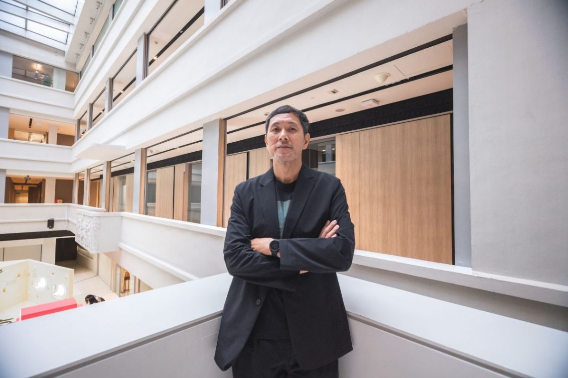
Article by Justin Zhuang
Modern. Economical. Orderly. These are some of the ways to describe the works of Hanson Ho. They are also the traits that many associate with Singapore, the country that the graphic designer calls home.
It is no coincidence for Ho. His approach to design has been a response to the poor perception of designers in Singapore since the day he enrolled in the visual communications course at Temasek Polytechnic in 1995. Having struggled academically in junior college, Ho opted not to pursue a degree but turned to design instead. He had long been interested in the creative fields, such as fashion, music and the arts, and graphic design seemed a “cool” way of making a living even though it was an unconventional path.

When I was in design school, a lot of people thought it was not a good profession to be in, not common and definitely not sought after,” says Ho. “There was a need or desire for me to prove to myself and to society that graphic design could be lucrative and a successful profession, whatever that meant to people in Singapore.
— Hanson Ho
This led the young designer to question many popular trends in the field then. His lecturers were preaching the use of witty, visual puns to capture attention, while many classmates were captivated by the newly available computer graphics software and using it to generate highly expressive designs. Ho, however, felt such “noisy and chaotic” designs were not easy to understand and would look dated in time to come.
“At that time, I realised that these things were fun, artistic and all, but it wouldn’t be sustainable in the corporate world,” Ho explains. “I felt things have to be easily understood and communicate to stakeholders and to audiences.”
Becoming modernist
An encounter with the designs of the late Josef Müller Brockmann showed him a way out. Ho had discovered a library book by chance of the Swiss graphic designer who during the 1950s championed the use of grid system to layout pages and geometric shapes to create clean and simple graphics. Such modernist designs powered the rise of the profession in the second half of the 20th century as the approach was widely adopted by corporations around the world. But it fell out of favour during the 1980s and 1990s as many professionals felt it had become a bland style that ignored local aesthetics.
Ho, however, saw modernist graphic design as relevant for Singapore and felt it was misunderstood. The systematic approach was an efficient means of producing clear and orderly works that were easily understood by businesses and general audiences. Unlike what critics said, Ho discovered how modernist graphic design could generate distinctive designs as seen in his favourite music album covers by contemporary British designers such as Mark Farrow and Peter Saville. His interest in the works of conceptual artists such as Lawrence Weiner and Carl Andre also helped him recognise the minimalist design aesthetics as part of the language of conceptual art.
“You could design a very cool CD cover and annual report with this same approach. This is a thread that can run across for different clients, yet everything could look cool. That was what I really wanted to do,” says Ho.
Soon after graduation, he set up H55 in 1999 to pursue this approach that few in the Singapore design industry accepted then. A common complaint from lecturers and early clients were his minimalist work looked incomplete or too sterile. But Ho persisted by seeking out those who shared his vision. This included Cream, a now defunct boutique furniture store that retailed pieces by the likes of Jasper Morrison who is known for his austere aesthetics. Another was The Substation, Singapore’s first independent arts space which worked with graphic designers to produce its marketing materials.

Going national
Ho made a breakthrough in the mid-2000s when H55 was appointed to design the identity and marketing materials for the Singapore Pavilion, first at the Venice Art Biennale and followed by the Venice Architecture Biennale. These were part of a national effort to promote Singapore’s creative industries at the turn of the millennium and also Ho’s first projects with the government.
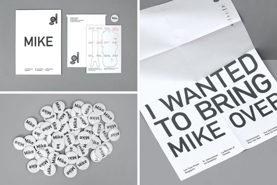
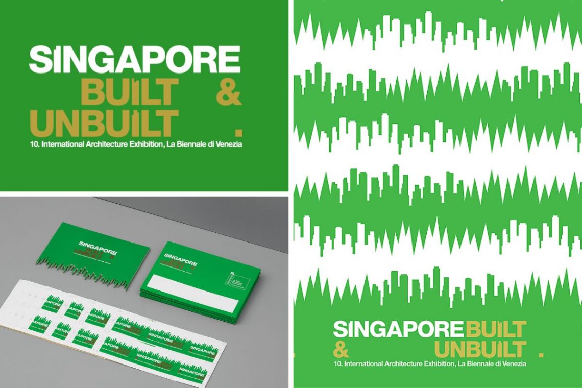
In response to artist Lim Tzay Chuen’s proposal for the National Arts Council to ship the 80-tonne Merlion sculpture to Venice to meet visitors for the 2005 exhibition, H55 created signage, collectibles as well as a brochure that simply used text to convey the intention of the conceptual work. The following year, H55 branded the “Singapore Built & Unbuilt” architecture showcase commissioned by the DesignSingapore Council (Dsg) and the Urban Redevelopment Authority (URA). Ho created a motif that combined the outline of the Singapore skyline with a grass-like pattern to express its vision of being a “City in the Garden”. This single graphic was repeated systematically to create a variety of ephemera from the exhibition walls to brochures and even a catalogue.
“When I started some of these work with Dsg and URA, many designers didn’t want to work with the government,” says Ho.
Small studios like his were put off by the bureaucratic process of tendering for work and thought the designs would not turn out looking good. But H55 showed otherwise and even drew comments that its designs “did not look like government work”, he adds.
“People realised that government work can look cool. But it’s all a mindset. Why do you care if it’s government or not? With any opportunity, you are meant to make the best work out of it,” explains Ho. “From these, I also realised I can do more government work if suitable. I began aspiring to do a lot more ‘national’ projects.”
The power of restraint
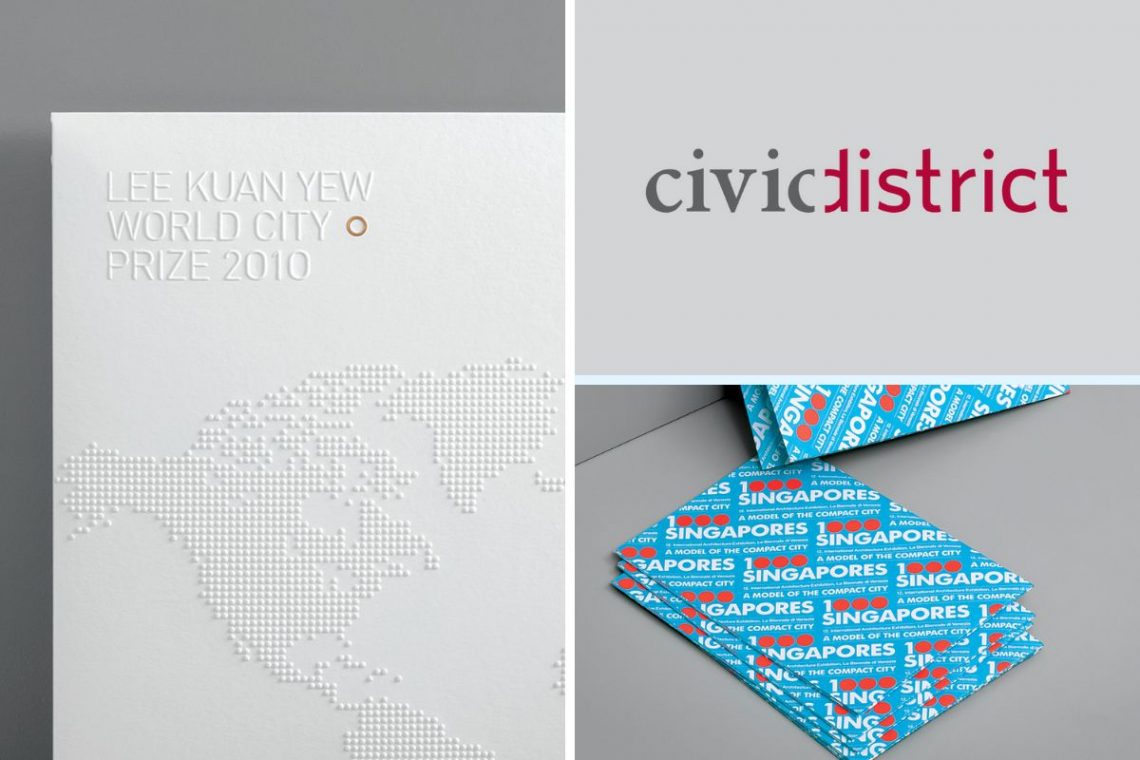
Over the next decade, Ho completed many more projects that spoke of Singapore, including branding the Lee Kuan Yew World City Prize and the Civic District. A common thread through these works is their simple and relatable forms. Consider his branding for the Singapore Pavilion at the 2011 Venice Architecture Biennale which uses three red dots to form the numeral in the title 1000 Singapores They illustrate the exhibition’s key message of Singapore as a compact urban model that can be replicated anywhere around the world. The exhibition even received a project which received a Design of the Year in the President*s Design Award (P*DA) 2011.
Another example is the Assembly Bag, which Ho created as the fun pack for the 2007 National Day Parade in a project commissioned by Dsg and the parade committee. The bag is a modular system of different coloured fabric panels joined together by open-ended nylon zips, which allowed parade-goers to exchange and customize their own designs and express the parade’s theme of Singapore as a “City of Possibilities”.

For Ho, these designs express his personal belief that graphic design is about distilling a message to its most fundamental visual elements. He has also found this approach to be helpful in “national” projects because they involve many stakeholders, including different government agencies, the public and even an international audience. Simple and restrained designs that do not require much explanation help to bring the message across effectively and economically, Ho adds.

I see this as an innate response to the Singapore environment I grew up in… I guess creativity is very much about working within restraints, not just in Singapore but around the world. There is always this restraint in my design, like it should not do too much. It should not shout. It should not be overly decorative… the design is the result of all these negotiations and restraining orders that are in my mind.
– Hanson Ho
Bringing Singapore design to the world
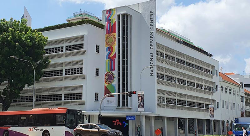
The work of H55 has certainly resonated with an audience in Singapore. Ho is a two-time recipient of the P*DA, including being named the Designer of the Year in 2012. These accomplishments validate his decision to be a graphic designer and his efforts to prove it can be a lucrative profession in Singapore. Ho credits Dsg for raising awareness of the profession through programmes like the P*DA, establishing a National Design Centre and organising events throughout the year to bring together a community of designers and people who are interested in creativity. The bustling design scene today was completely unlike the creative “desert” he recalls as a young designer.
Along with Dsg, Ho was also part of a new generation of graphic designers then, including Chris Lee, Pann Lim, Jackson Tan and Kelley Cheng who shared a belief that designers were no longer just service providers but also authors in their own right. Together, they pushed the idea of a Singapore design culture by injecting personalities into their work and even designing products. Many of these were showcased in early Singapore showcases overseas organised by Dsg, including 20/20 and SINGAPOREdge. Ho, for instance, developed a series of T-shirts and publications under his Rabbit brand that were eventually retailed at cult fashion boutiques overseas such as Dover Street Market and Colette, the Magma bookshop in London and the Palais de Tokyo art museum.


The purpose was to see if these things we created could be in certain stores around the world and make a name for ourselves,” Ho says. “It was this idea of wanting to be internationally recognised as a Singaporean and that Singapore design can be international.
– Hanson Ho
A design for life
Bolstered by their global success, Ho and his peers co-founded The Design Society in 2009 to awareness of visual communications at home. As managing editor of the society’s bi-annual journal over the next four years, Ho used it as a platform to spotlight local designs and encourage more discourse about local visual culture.
“We wanted to bring a kind of consciousness to the public and also to designers themselves that what we do should be celebrated. It’s not just for making money or to boost the economy. Design is also prevalent in our day-to-day culture, and didn’t just come about from thin air,” he says.
Ho has undoubtedly proved that design is a profession no less worthy than others in Singapore through the many marks he has created that have bettered the image of businesses and the nation too. But one of the most important impacts of design is helping him understand his life purpose and relationship with the world.
“Typically, when we think of better by design it is about design making life better… But then thinking a bit deeper, personally better by design is also a way of looking into oneself,” Ho says. “It is a kind of introspective journey of asking yourself what kind of world do you want to live in, not just physically but in mind, body and spirit.”
Read our unfolding series of stories on creative discovery and making life in Singapore ‘Better by Design’.
